
The Idea Bank, spearheaded by Graphic Design instructors at Holland College’s Graphic Design studio, is a forward-thinking movement. Its aim is to establish an online platform where creatives can share their artworks and designs for sale. The generated funds will support students in meeting specific financial needs. The core values driving this initiative are flexibility, unity, vision, the flow of ideas, and freedom.
The Problem
One potential design problem for a logo in this context could be effectively conveying the multifaceted nature of The Idea Bank’s mission. Balancing elements that represent creativity, financial support, and community engagement while maintaining simplicity and clarity can be challenging.
Additionally, ensuring that the logo resonates with both creatives unity/contributing, to the platform and potential buyers is important for its success. Striking a balance between visual appeal and conveying the purpose and values of The Idea Bank is crucial in addressing this design challenge.
Mood Board

The solution
The logo icon seamlessly blends the sleek curves of the ‘d’ ‘e’ and ‘b’ ‘a’ characters from the cutting-edge Astro typeface, serving as the project’s signature mark. Not only does it represent the project’s default typeface, but it also cleverly embodies a hand gesture, symbolizing the visionary approach behind The Idea Bank initiative.
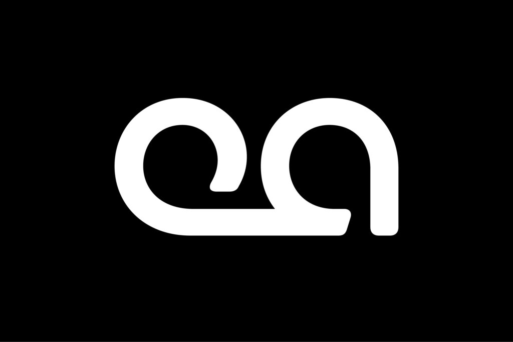
This fusion of typography and symbolism captures the essence of creative innovation and forward-thinking vision, setting a bold and distinctive tone for the project. Furthermore, the icon has been artfully integrated into the full logo design, ensuring horizontal optimization for screens, thus maintaining its visual impact across various digital platforms.

